Design Fails (1)
or
These designers never used a ruler
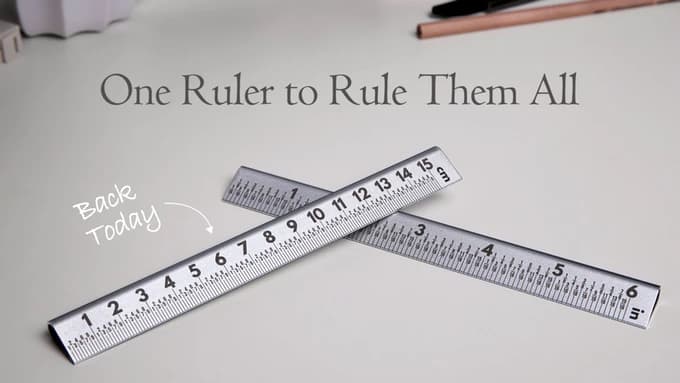
From time to time I roam around Kickstarter and take a close look at some of the campaigns. Pretty often their descriptions read like they re-invented <basic item> and furthermore promise fantastic things. One of these is “The New 30° Ruler”, which claims to be a superior ruler in every way.
This is not their first Kickstarter campaign; I pledged during their last campaign and got a ruler similiar to those in this campaign. They are well made and the artisanal quality is out of question.
I’d rather question a particular design decision they made, and why it’s made wrongly.
Picture by Orangeredlife, all rights reserved.
Maybe you can already spot what’s looking off here.
As usual there is an introduction video at the top of the Kickstarter page, which highlights all the good stuff this campaign has to offer.
Funnily enough they even show how you would expect how to operate a ruler first:
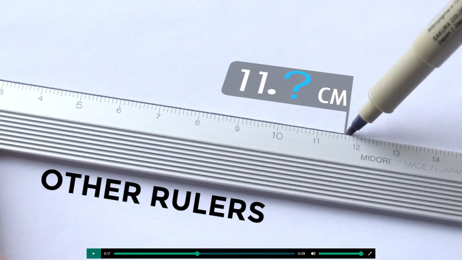
Right after you can see the shiny 30° ruler:
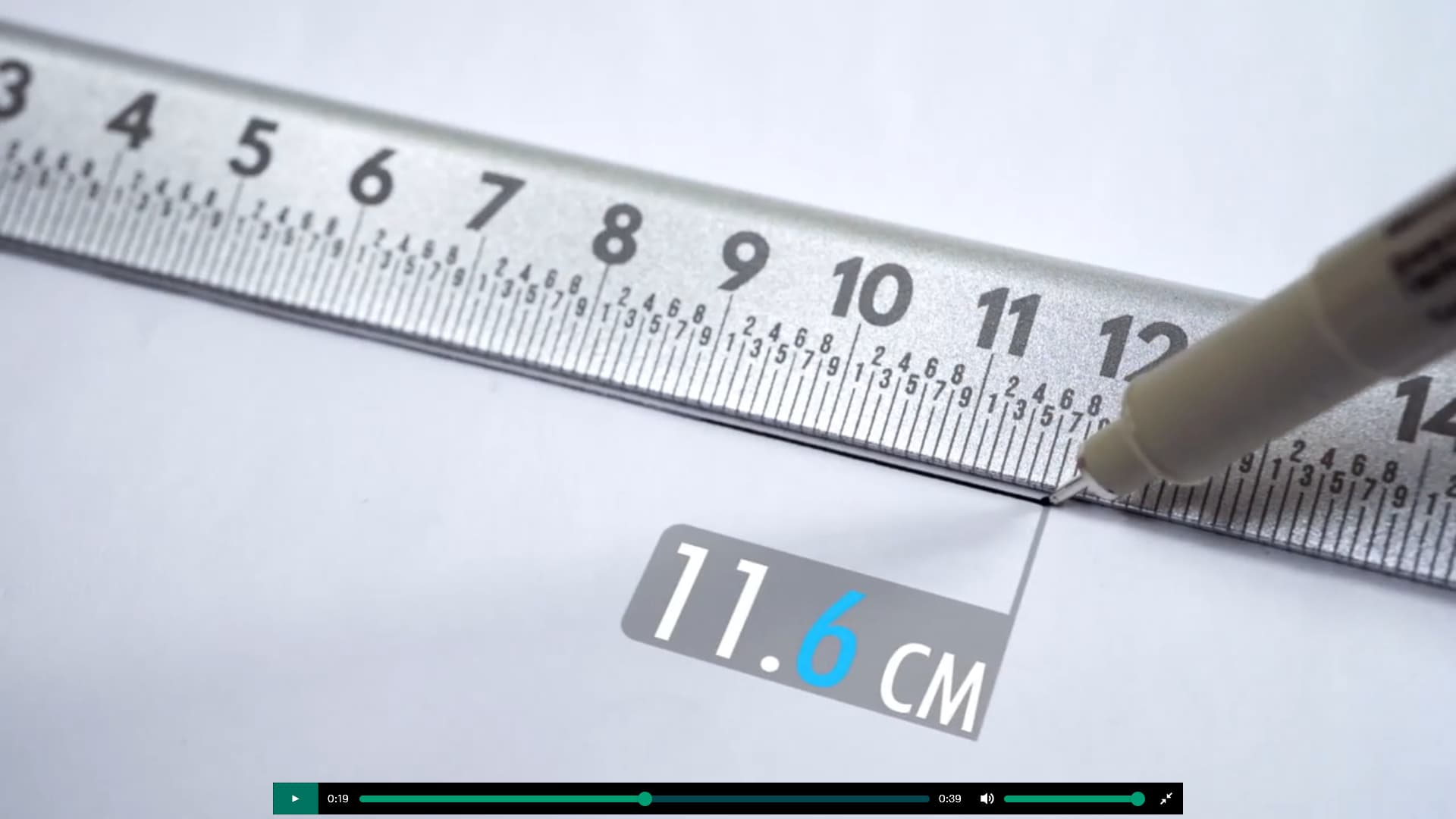
Apparently the “designers” behind this Kickstarter campaign are of the opinion that a ruler has been held fundamentally wrong by all people so far.
A bold claim, to be sure! And one I can not really agree on.
Of course you’re free to hold it the other (the “right”) way, but then the numbers aren’t any longer facing you. And if you are right handed, you will always draw lines from left to right, which complicates one of the main missions of a ruler: Drawing a line with a certain length.
In the short clip they seem to make the point that their method is much more precise. But how to hold this ruler? You’d always need to juggle your pen beneath your holding hand…
I even wrote to them to explain what problem I have with this design. They shrugged it off however. I’m a bit disappointed to see they made their mistake twice…
Comments